響應式網頁前端設計【第一階段】加強熟識HTML&CSS
CSS3 Flex Box彈性框
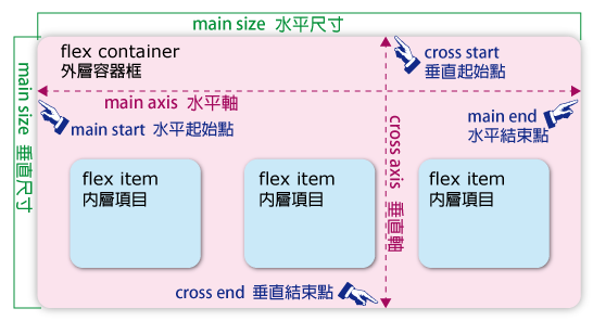
CSS Flex Box 彈性框的概念
有關 Flex Box 彈性框的新屬性
| no | 應用於 | 屬性名稱 | 說明 | 屬性值 | 說明 | 範例 |
|---|---|---|---|---|---|---|
| 1 | container | display | 彈性框的模式 | flex | inline-flex | ||
| 2 | container | flex-direction | 內容項目排列方向 | row | row-reverse | column | column-reverse | w3s | w3s |
| 3 | container | justify-content | 內容項目水平對齊方式 | flex-start | flex-end | center | space-between | space-around | w3s | w3s |
| 4 | container | align-items | 內容項目垂直對齊方式(文字為主) | stretch | center | flex-start | flex-end | baseline | w3s | w3s |
| 5 | container | align-content | 內容項目垂直對齊方式(框架為主) | stretch | center | flex-start | flex-end | space-between | space-around | w3s | w3s |
| 6 | container | flex-wrap | 內容項目是否換行 | nowrap | wrap | wrap-reverse | w3s | w3s |
| 7 | container | flex-flow | 內容項目排列順序與方向 | flex-direction flex-wrap | w3s | w3s |
| 8 | item | order | 內容項目指定排列順序 | number | w3s | w3s |
| 9 | item | flex-grow | 指定項目的寬度放大倍數 | number | w3s | w3s |
| 10 | item | flex-shrink | 指定項目的寬度縮小倍數 | number | w3s | w3s |
| 11 | item | flex-basis | 指定項目的寬度(px) | number | w3s | |
| 12 | item | flex | 指定項目的寬度指定方式 | 0 | 1 | flex-grow flex-shrink flex-basis | aut | w3s | |
| 13 | item | align-self | 指定項目的垂直對齊方式 | auto | stretch | center | flex-start | flex-end | baseline | w3s | w3s |
範例已設定好的部份
  <div class="container">
      <div class="item"></div>
      <div class="item"></div>
      <div class="item"></div>
  </div>

  <style>
  .container { background-color: #ffc0ee; max-width: 800px; min-height: 200px;
               margin: 10px auto; padding: 5px; }
  .item { background-color: #a2a2f0; margin: 5px; padding: 5px; }
  </style>
1. 彈性框的指定顯示模式 ( display : flex | inline-flex ) TOP

Item1
Item2 Item2
Item3 Item3 Item3
2. 內容項目排列方向 TOP
( flex-direction : row | row-reverse | column | column-reverse | initial )
Item1
Item2 Item2
Item3 Item3 Item3
3. 內容項目水平對齊方式 TOP
( justify-content : flex-start | flex-end | center | space-between | space-around | initial )
Item1
Item2 Item2
Item3 Item3 Item3
4. 內容項目垂直對齊方式(文字為主) TOP
( align-items : stretch | center | flex-start | flex-end | baseline | initial )
Item1
Item2 Item2
Item3 Item3 Item3
5. 內容項目垂直對齊方式(框架為主)
---- 每個 .item 加了設計 width: 100px; TOP
( align-content : stretch | center | flex-start | flex-end | space-between | space-around | initial )
Item1
Item2
Item3
Item4
Item5
Item6
Item7
Item8
Item9
6. 內容項目是否換行 TOP
( flex-wrap : nowrap | wrap | wrap-reverse | initial )
Item1
Item2
Item3
Item4
Item5
Item6
Item7
Item8
Item9
Item1
Item2
Item3
Item4
Item5
Item6
Item7
Item8
Item9
測試練習:導覽按鈕在導覽區的正中央 參考結果
測試練習:導覽按鈕在導覽區的右下角 參考結果